
How to randomly position points in a circle with R and ggplot
Published:
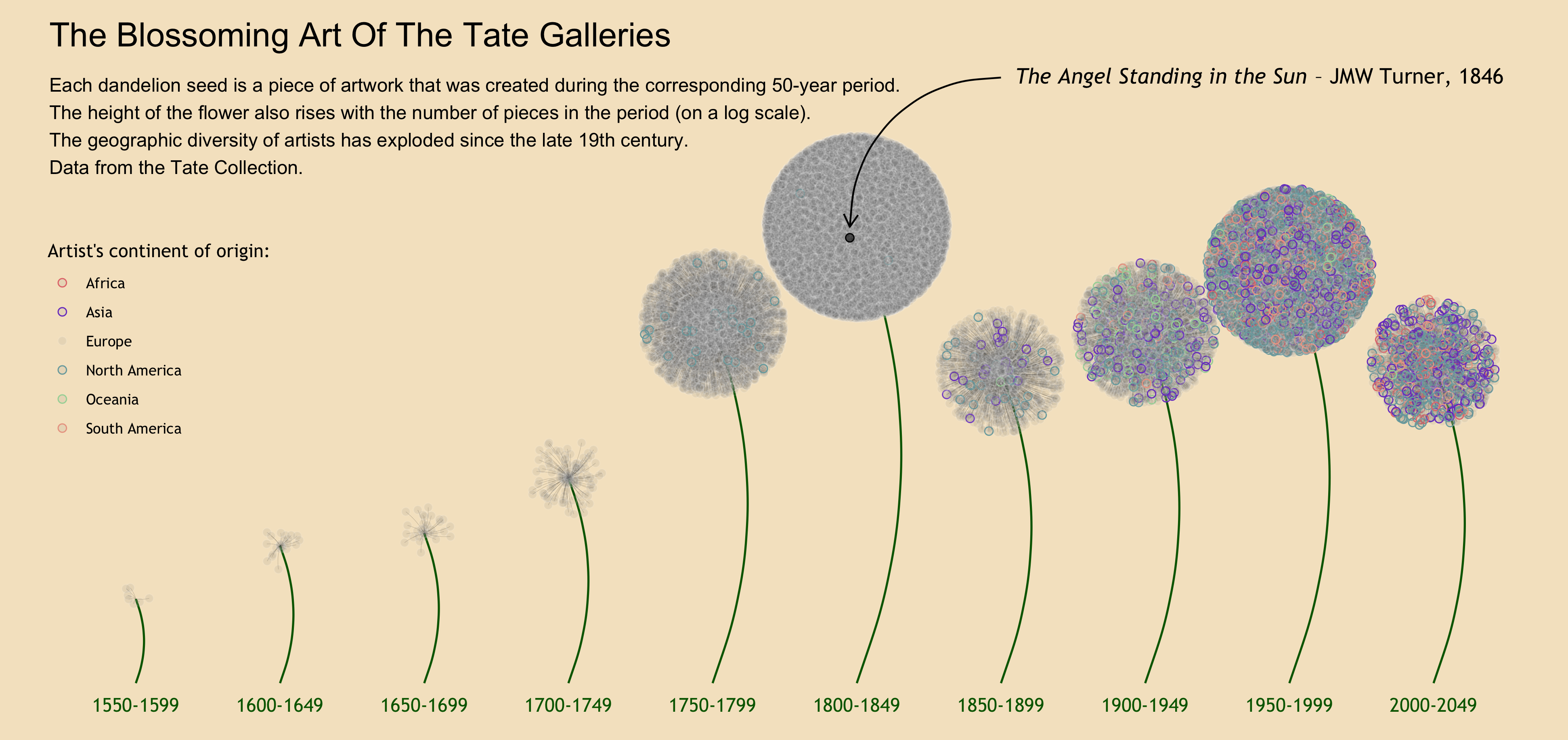
I realized after writing my last TidyTuesday post about Art Collections (picture below) that I did not really explain how the dandelion seeds were visualized. More specifically, I didn’t elaborate on how I randomly positioned the points around the center of each flower. Since this took me a little bit of time to figure out and is not self-explanatory, I thought I would write a quick post making it easy to understand the process.
For the purpose of this post, let’s suppose we want to visualize the distribution of students among three classes of a same grade in a school, to show the association between parental income and class size we have uncovered (the richer students get to be in the smallest class!). The visualization we want to make is simple: three big circles representing the three classes, dots representing the students scattered in these circles, and the color of the dots representing parental income.
Let’s first simulate this hypothetical dataset.
library(tidyverse)
library(ggforce)
set.seed(2021)

class <- 1:3
student_name <- paste("student_", 1:150, sep = "")
parental_income <- (rbeta(150, 2, 6)+1)*1000
student_class <- ifelse(parental_income < 1400, sample(class, size = length(parental_income[parental_income<1400]), replace = TRUE, prob =c(1,1,0.3)), sample(class, size = length(parental_income[parental_income>=1400]), replace = TRUE, prob =c(0.5,0.5,1)))

students <- tibble(
  student_name,
  parental_income,
  student_class
)
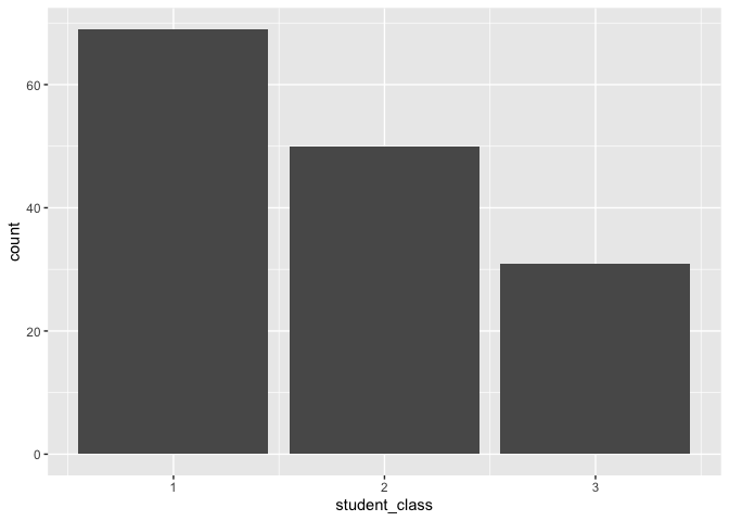
Here we are. One class (in which wealthiest students are overrepresented, though that isn’t apparent yet) is clearly smaller than the others.
students %>%
  ggplot(aes(x = student_class)) +
  geom_bar()
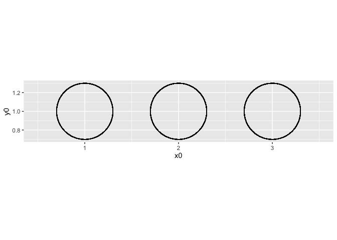
Now I want to visualize three circles, and show the students as scattered dots in each class. I will then color the students depending on their parents’ revenue.
To draw the circles, I use the convenient geom_circle() function from the ggforce package.
students %>%
  ggplot() +
  geom_circle(aes(x0 = 1, y0 = 1, r = 0.3)) +
  geom_circle(aes(x0 = 2, y0 = 1, r = 0.3)) +
  geom_circle(aes(x0 = 3, y0 = 1, r = 0.3)) +
  xlim(0.5, 3.5) +
  coord_fixed()
Now, I want the to appear as dots in these three circles, depending on their class. Before I knew how to scatter them in a nice way, I would probably have tried to add some jitter. The issue with this is that they will be randomly scattered in a square of the specified jitter’s width and height. I will get something like this. It’s not horrible, but we can do better.
students %>%
  ggplot() +
  geom_circle(aes(x0 = 1, y0 = 1, r = 0.3)) +
  geom_circle(aes(x0 = 2, y0 = 1, r = 0.3)) +
  geom_circle(aes(x0 = 3, y0 = 1, r = 0.3)) +
  geom_jitter(aes(x = student_class, y = 1),
              width = 0.2,
              height = 0.2,
              size = 2) +
  xlim(0.5, 3.5) +
  coord_fixed()
How to randomly position dots in a circle?
Doing this uses very basic concepts of trigonometry. We want to randomly assign the distance of the dot from the center, and the “direction” of the dot (think about it as a number from 0 to 11:59 around the clock). We then need to translate these into Cartesian coordinates to be visualized on the plot.
-
Distance from the center: we randomly assign to each observation a number from 0 to 1, which we multiply by the length radius.
-
Direction: we randomly assign to each observation a number from 0 to 2π. In trigonometry, your direction is indicated by a number from 0 to 2π. 0 is the 3 o’clock position, p**i is the 9 o’clock position, etc.
-
Translate into Cartesian coordinates: finally, you use the cosinus and sinus functions to transform these two dimensions into an x coordinate and a y coordinate.
In our hypothetical example, this will look like this.
students_scattered <- students %>%
  mutate(
    # First, the distance to the center
    # We have defined the radius of the circles as 0.3 in the previous plots, so I make this one 0.28 to make sure the dots fit.
    distance_to_center = runif(nrow(students), 0, 1)*0.28,
    # Second, the "direction" around the clock
    direction = runif(nrow(students), 0, 1)*2*pi,
    # Now the x-coordinate (centered around the class of each student)
    x = student_class + distance_to_center*cos(direction),
    y = 1 + distance_to_center*sin(direction)
    )
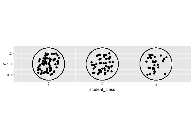
I now visualize the classes using these new coordinates:
students_scattered %>%
  ggplot() +
  geom_circle(aes(x0 = 1, y0 = 1, r = 0.3)) +
  geom_circle(aes(x0 = 2, y0 = 1, r = 0.3)) +
  geom_circle(aes(x0 = 3, y0 = 1, r = 0.3)) +
  geom_point(aes(x = x, y = y),
              size = 2) +
  xlim(0.5, 3.5) +
  coord_fixed()

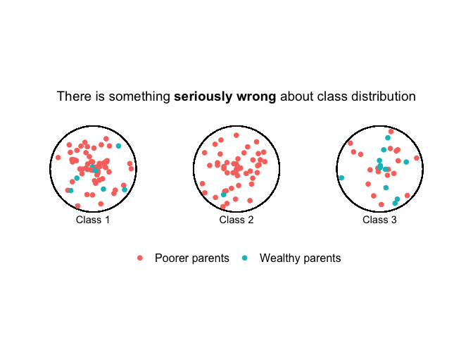
Here we have it! All that is left is to color the dots depending on parental wealth, and send it to the principal’s office to complain about issues of justice.
students_scattered_income <- students_scattered %>%
  mutate(rich = if_else(parental_income > 1400, "Wealthy parents", "Poorer parents"))

students_scattered_income %>%
  ggplot() +
  geom_circle(aes(x0 = 1, y0 = 1, r = 0.3)) +
  geom_circle(aes(x0 = 2, y0 = 1, r = 0.3)) +
  geom_circle(aes(x0 = 3, y0 = 1, r = 0.3)) +
  geom_point(aes(x = x, y = y, color = rich),
              size = 2) +
  xlim(0.5, 3.5) +
  ylim(0,2) +
  coord_fixed() +
  annotate(geom = "text",
           label = c("Class 1", "Class 2", "Class 3"),
           x = c(1, 2, 3),
           y = 0.65) +
    annotate(geom = "text",
           label = expression(paste("There is something ", bold("seriously wrong"), " about class distribution")),
           x = 2,
           y = 1.5,
           size = 5) +
  labs(color = "") +
  guides(col = guide_legend(nrow = 1)) +
  theme_void() +
  theme(legend.position = c(0.5, 0.25),
        text = element_text(size = 15))
Let me know what you think or ask/suggest anything about the code in the comments. And if you’re new to R programming, have a look at my post about R resources to get started.