
TidyTuesday (01/05/2021): Art Collections
Published:
About TidyTuesday
If you don’t know about it, TidyTuesday is a project put together by Thomas Mock aimed at providing the R community with an opportunity to apply their visualization and analysis skills and to discuss their work. Every week on Tuesday, a tidy dataset (one row per observation and one column per variable) is uploaded on the GitHub page of the project. R users then share their work on the dataset on Twitter using the #TudyTuesday hashtag.
TidyTuesday - January 12th, 2020: Art Collections
This week, the data comes from the Tate Art Museum. It contains two dataset, one referencing the pieces of artwork in the collections (almost 70,000 observations), and one referencing the artists. They can easily be merged together thanks to a common artistId variable.
library(tidytuesdayR)
library(tidyverse)
library(scales)
library(extrafont)

tuesdata <- tt_load('2021-01-12')
artists <- tuesdata$artists
artwork <- tuesdata$artwork
For this week, no idea came as easy as for the Transit Costs Project last week. But after a bit of thinking I decided to make something that evokes how “blossoming” the Tate art has been in the past few centuries. So I wanted my dataviz to evoke flowers.
First I wanted to know where artists are from. This was tedious because the names of the countries were each written in their language of origin (but with the latin alphabet). It actually ended up being pretty fun to look up. I’ll spare you the lines of code where I adjust each country’s name, but I can send them to you if you send me a private message on Twitter with your email address. In the same hidden chunk of code, I merged the artists dataset with a downloaded dataset referencing continents for each countries, because I knew I wanted to visualize artists’ origin, but couldn’t reasonably do it for more than 50 countries.
I then merged both dataset to get the final, clean data I would work with.
artwork_clean_1 <- artwork %>%
  rename(artist_id = artistId) %>%
  left_join(artists_clean, by = "artist_id")
I decided to visualize the evolution of the number of pieces over time. I first thought of indicating the age of the artist on the y-axis.
artwork_clean_2 <- artwork_clean_1 %>%
  mutate(age_of_artist = year - birth) %>%
  filter(age_of_artist > 0)

artwork_clean_2 %>%
  ggplot(aes(x = year, y = age_of_artist)) +
  geom_point()
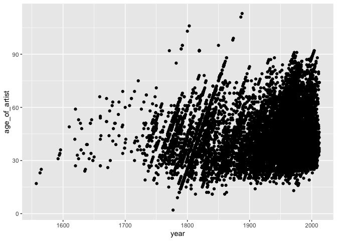
This is pretty confusing and ugly. Not too much to get from it. Instead,I thought I would group the pieces of artwork by period in some sort of “flowers”, showing how “flourishing” each period was by generating a bigger flower for periods in which more pieces were created.
I first did some more cleaning to get my final dataset.
artwork_clean_3 <- artwork_clean_2 %>%
  mutate(period = (year %/% 50)*50) %>%
  filter(!is.na(origin),
         !is.na(year),
         !is.na(continent)) %>%
  select(id, period, year, age_of_artist, title, artist_id, name, gender, birth, origin, continent)
I then clumsily tried to group the observation in flowers:
artwork_clean_3 %>%
  ggplot(aes(x = period, y = 1)) +
  geom_jitter(width = 20, height = 0.2) +
  ylim(0,2)
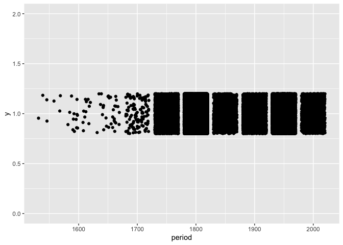
This is indeed very ugly. Beside the obvious overplotting, I wanted each flower to have a different height. I decided to make flowers from periods with more pieces taller, since a flower gets larger as it grows.
I also wanted the flowers to look a bit like flowers. So I remembered this beautiful visualization about the #MeToo Movement (check it out) and decided to have my flowers look circular like dandelions.
I first created the variable that would provide the height of each flower. I used a log scale to make sure flowers still had reasonably similar heights.
log_count <- artwork_clean_3 %>%
  count(period, sort = TRUE) %>%
  mutate(log_count = log(n)) %>%
  select(-n)

artwork_clean <- artwork_clean_3 %>%
  left_join(log_count, by = "period")
I then randomly generated a position on their dandelion for each piece of artwork (each would be a seed). I explain how to position dots randomly in a circle in a distinct post.
set.seed(2021)

art_flowers <- artwork_clean %>%
  mutate(
    radius = log_count/5,
    theta = runif(nrow(artwork_clean), 0, 1)*2*pi,
    distance_to_center = radius*runif(nrow(artwork_clean), 0, 1),
    x = period + distance_to_center*cos(theta)*15,
    y = log_count + distance_to_center*sin(theta)
    )
This is what I had at this point. I fixed the coordinates so that the flowers would look round.
art_flowers %>%
  ggplot(aes(x = x, y = y )) +
  geom_point(alpha=0.5) +
  ylim(-1, 15) +
  coord_fixed(ratio = 15)
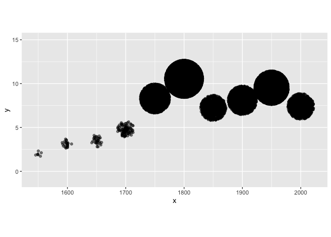
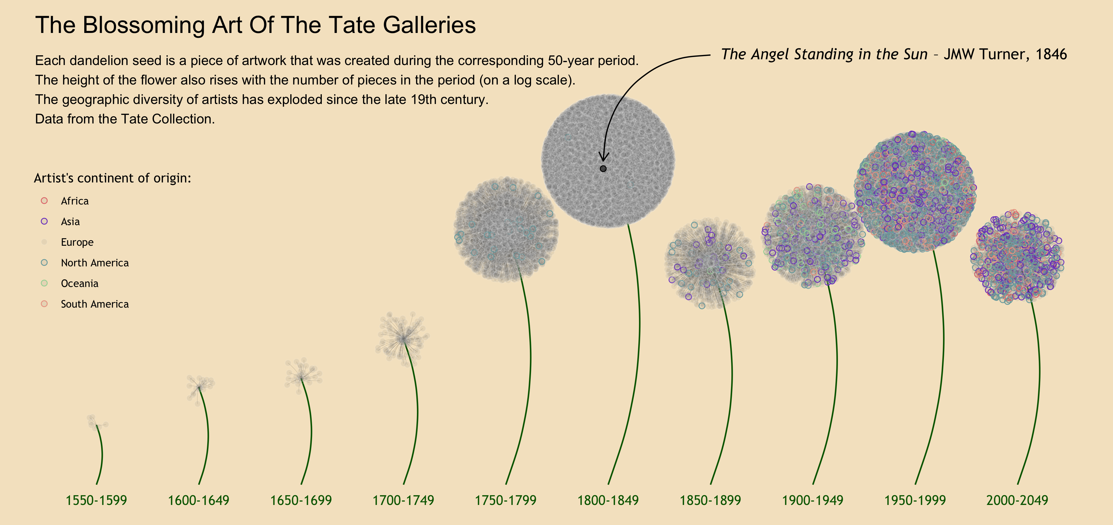
This is the essence of what I needed! Now what was left was just the (long!) process of making it look better. Here is the code for the final result:
stems <- artwork_clean %>%
  group_by(period) %>%
  summarise(
    x = mean(period),
    xend = mean(period),
    y = 0,
    yend = mean(log_count)
  )

dates <- seq(1550, 2000, by = 50)

palette_colors = c("Europe" = alpha("white", 0.1), "Asia" = "#7B45C9", "North America" = "#79A9AC", "Oceania" = "#A5D6A5", "South America" = "#EBA491", "Africa" = "#E4797A")

art_flowers %>%
  ggplot(aes(x = x, y = y )) +
  annotate(geom = "curve",
         x = stems$x,
         xend = stems$xend,
         y = stems$y,
         yend = stems$yend,
         curvature = 0.2,
         color = "darkgreen",
         size = 0.6) +
  geom_curve(aes(x = period,
                 xend = x,
                 y = log_count,
                 yend = y),
             size = 0.05,
             curvature = 0.1,
             color = "9CCE81",
             alpha = 0.5) +
  geom_point(aes(color = continent),
             size = 2,
             shape = 21,
             fill = alpha("grey50", 0.1)) +
  annotate(geom = "point",
           x = 1797.580,
           y = 10.29637,
           size = 2,
           shape = 21,
           fill = alpha("black", 0.6)) +
  annotate(geom = "curve",
           x = 1850,
           xend = 1797.580,
           y = 14,
           yend = 10.55,
           curvature = 0.45,
           arrow = arrow(angle = 30, length = unit(0.3, "cm"))) +
  annotate(geom = "text",
           x = 1855,
           y = 14,
           label = expression(paste(italic("The Angel Standing in the Sun"), " – JMW Turner, 1846", sep = "")),
           hjust = 0,
           family = "Trebuchet MS",
           size = 4.5) +
  annotate(geom = "text",
           x = dates,
           y = rep(-0.5, 10),
           label = paste(as.character(dates), "-", as.character(dates + 49), sep = ""),
           size = 4,
           color = "darkgreen",
           family = "Trebuchet MS") +
  annotate(geom = "text",
           x = 1520,
           y = 15,
           label = "The Blossoming Art Of The Tate Galleries",
           hjust = 0,
           size = 7) +
  annotate(geom = "text",
           x = 1520,
           y = 14,
           label = "Each dandelion seed is a piece of artwork that was created during the corresponding 50-year period.\nThe height of the flower also rises with the number of pieces in the period (on a log scale).\nThe geographic diversity of artists has exploded since the late 19th century.\nData from the Tate Collection.",
           hjust = 0,
           vjust = 1,
           size = 4) +
  scale_color_manual(values = palette_colors) +
  ylim(-1, 15) +
  coord_fixed(ratio = 15) +
  labs(color = "Artist's continent of origin:") +
  theme_void() +
  theme(
    legend.position=c(0.1145, 0.55),
    text = element_text(family = "Trebuchet MS"),
    panel.background = element_rect(fill = "#f5E5C9",
                                    color = "#f5E5C9")
  )
Let me know what you think or ask/suggest anything about the code in the comments. And if you’re new to R programming, have a look at my post about R resources to get started.